 by
by Retail Layout and Design refers to the strategic arrangement of physical space, fixtures, merchandise, signage, lighting, and customer pathways within a store to influence shopping behavior, optimize operational efficiency, and reinforce brand identity. Unlike mere interior decoration, effective layout design is grounded in consumer psychology and retail analytics—guiding customers through high-margin zones, minimizing congestion, maximizing product exposure, and reducing staff effort for restocking. Key elements include floor plans (grid, racetrack, free-flow), fixture placement, sightlines, adjacency logic (complementary products placed together), and atmospheric cues (lighting, color, music, scent). A well-designed layout increases sales per square foot, improves customer satisfaction (easier navigation, faster checkout), and reduces shrinkage (better surveillance). Poor layout creates dead zones, frustrates shoppers, and leaves revenue unrealized. Layout decisions are long-term investments requiring regular refinement based on traffic pattern data and category performance.
Importance of Layout in Retailing:
1. Improves Customer Convenience
A good store layout makes shopping easy and comfortable for customers. Proper arrangement of aisles, shelves and sections helps customers find products quickly. Clear pathways reduce confusion and save time. When customers move easily in the store, they feel satisfied. Convenient layout encourages customers to spend more time in the store. This increases chances of purchase. Retailers design layouts to guide customer movement smoothly. Improved convenience leads to better shopping experience and repeat visits.
2. Increases Sales
Store layout plays an important role in increasing sales. Proper placement of products attracts customer attention. High demand and promotional items are placed in visible areas. Attractive displays encourage impulse buying. Layout guides customers through different sections, increasing exposure to products. When customers see more products, chances of purchase increase. A well planned layout helps retailers maximize sales.
3. Better Space Utilization
Effective layout helps in using available space efficiently. Retailers can display more products without overcrowding. Proper arrangement avoids wastage of space. It ensures that every area of the store is used productively. Good space utilization reduces costs and improves store performance. It also helps in maintaining a clean and organized environment.
4. Enhances Customer Experience
A well designed layout creates a pleasant shopping environment. Proper lighting, spacing and arrangement improve comfort. Customers enjoy shopping in an organized store. Easy navigation and attractive display increase satisfaction. Good experience encourages customers to return. Retailers focus on layout to create positive impression.
5. Improves Product Visibility
Layout helps in improving product visibility. Products placed at eye level or near entrance attract more attention. Proper arrangement ensures that customers can easily see and access items. Visibility increases chances of purchase. Retailers use layout to highlight important products.
6. Supports Store Management
A proper layout makes store management easier. It helps employees in handling stock, billing and customer service. Organized sections reduce confusion and improve efficiency. Staff can locate products quickly. This improves overall operations. Good layout supports smooth functioning of retail business.
Factors affecting Retail Store Layout:
1. Store Size and Shape
The physical dimensions and geometry of a store dictate feasible layout options. Long, narrow spaces suit grid layouts; wide, shallow spaces favor free-flow designs. Irregular shapes (L-shaped, curved walls, structural columns) create dead zones or require custom fixtures. Small stores (under 1,000 sq ft) must maximize every inch with high-density shelving; large stores (over 50,000 sq ft) need clear zoning and wide aisles to prevent customer fatigue. Ceiling height affects vertical display potential (mezzanines, tall shelving). Load-bearing column placement limits fixture positioning. Retailers must work within architectural constraints, sometimes choosing locations based on layout suitability.
2. Product Assortment and Characteristics
Product size, shape, weight, perishability, and security needs directly influence layout decisions. Small, high-theft items (cosmetics, electronics) require locked cases or cash-wrap adjacency. Large, bulky products (furniture, appliances) need open floor space for walkaround viewing. Perishable foods demand refrigerated perimeter placement with proper air circulation. Fragile items require lower shelving to prevent breakage. High-impulse products (candy, batteries) belong at checkout zones. Products requiring customer evaluation (apparel fitting rooms, electronics demo stations) need adjacent space. The number of SKUs also matters: thousands of small grocery items need efficient grid layouts; limited SKU specialty stores can use free-flow experiential layouts.
3. Target Customer Demographics and Behavior
Customer age, income, shopping purpose (quick trip vs. leisure browsing), and physical abilities determine layout choices. Elderly or disabled customers need wider aisles (minimum 5-6 feet for wheelchair turning), lower shelving, non-slip flooring, and accessible fitting rooms. Stores serving hurried commuters (convenience stores, pharmacy pickups) need clear sightlines to priority items and fast checkout routing. Stores serving leisure shoppers (department stores, malls) can use meandering racetrack layouts encouraging exploration. Families with children need wide stroller-friendly aisles and visible kid zones. International tourists need clear signage with universal symbols. Customer traffic pattern analysis (from in-store sensors) should validate layout assumptions against actual behavior.
4. Brand Positioning and Store Image
Luxury retailers (Gucci, Tiffany) need spacious layouts with ample negative space, wide aisles, polished flooring, and carefully staged product vignettes—conveying exclusivity and allowing customers to appreciate each item without crowding. Discount retailers (D-Mart, Walmart) need dense, no-frills grid layouts prioritizing product volume and easy price comparison, with minimal display fixtures and functional lighting. Fun, youthful brands (kids’ stores, certain apparel chains) can use free-flow, irregular layouts with colorful fixtures, interactive displays, and music zones. Store layout must physically manifest brand promise—a discount store using luxury-style spacious layout wastes space; a luxury store using dense grid layout destroys aura. Consistency between layout and brand positioning builds customer trust; inconsistency creates confusion about price-quality expectations.
5. Type of Shopping (Destination vs. Impulse)
Destination shopping (buying specific planned items—groceries, prescriptions, hardware) requires efficient, logical layouts where customers find products quickly without navigating through unrelated categories. Grid layouts excel here. Impulse shopping (unplanned purchases—snacks, greeting cards, fashion accessories) requires layouts exposing customers to as many tempting items as possible, often through forced-path designs (racetrack routing customers past high-margin impulse zones). Mixed shopping trips (some planned, some impulse) require hybrid layouts: destination categories (milk, bread) easily accessible, impulse categories (candy, chips) strategically placed along the route to checkout. Destination-heavy formats (supermarkets) prioritize efficiency; impulse-heavy formats (bookstores, gift shops) prioritize discovery. Misunderstanding the primary shopping mission results in frustrated destination shoppers and missed impulse opportunities.
6. Operational Requirements and Staff Workflow
Layout must accommodate receiving, stocking, and customer service operations efficiently. Backroom-to-floor pathways should be short and unobstructed for quick restocking. Heavy pallet access needs wide back aisles. Cash wrap placement must allow staff visibility across the floor (theft prevention) and quick response to customer calls. Service areas (returns desk, fitting rooms, alterations, bike assembly) need specific space allocations with clear separation from selling floor to avoid clutter. Staff break areas, restrooms, and offices should be accessible without crossing customer paths. Planograms should consider restocking travel distances: frequently replenished items near backroom. Poor operational integration in layout increases labor costs (staff walking time) and reduces shelf availability (restocking delays). Layout design must balance customer experience with employee productivity.
7. Technology and Digital Integration
Modern layouts must accommodate digital touchpoints: self-checkout stations (space allocation for 4-6 units), BOPIS pickup lockers or counters, digital signage (screen placement, power supply), Wi-Fi access points, beacon sensors (phone detection for personalized offers), and electronic shelf labels (ESL) which require ceiling-mounted communication hubs. For omnichannel fulfillment, layouts need dedicated space for pickers to stage online orders without colliding with customers (dark store zones or early-morning picking routes). Scan-and-go systems require designated exit validation zones. Augmented reality try-on stations (furniture placement, virtual makeup) need open floor space and good lighting. Technology integration should feel seamless, not added-on. Failure to plan for technology results in retrofitting costs, unsightly wires, or abandoned digital initiatives due to layout incompatibility.
8. Security and Shrinkage Considerations
Layout design directly impacts theft prevention and inventory loss. High-risk categories (expensive cosmetics, small electronics, razor blades, alcohol, designer handbags) require placement in staff-monitored zones—near checkout counters, service desks, or directly in sightlines from cash wrap. Multiple cash wrap placements create overlapping surveillance zones. Fixture height should not create blind spots (over 5 feet in center aisles obstructs visibility). Mirrors at corners reduce hiding areas. Locked display cases and spider-wrap hook placements need electrical access. Emergency exits require clear paths but also must trigger alarms. CCTV camera placement must have clear sightlines without obstruction by tall fixtures. Theft-friendly layout features (long aisles blocking cashier sight, high fixtures creating hiding spots, poorly lit corners) invite shrinkage. Security should be integrated discreetly maintaining open, bright, visible environment is both theft-deterrent and customer-friendly.
Types of Layouts in Retail:
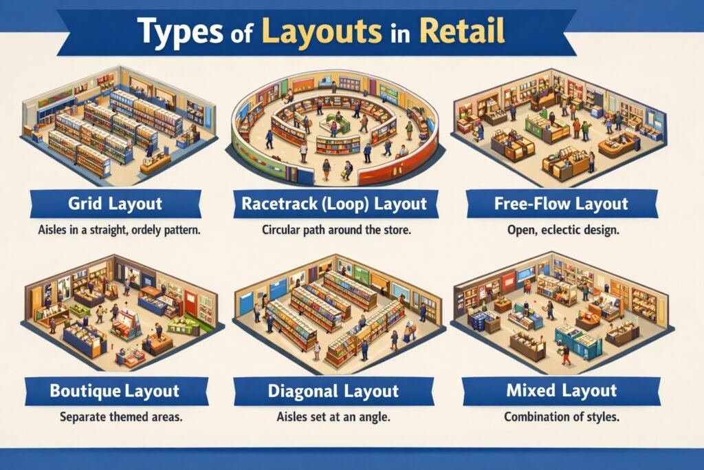
1. Grid Layout
The grid layout arranges fixtures and aisles in parallel rows, typically at right angles, creating a structured, efficient shopping environment. Dominant in supermarkets, drugstores, and hardware stores, it maximizes space utilization and facilitates planned, task-oriented shopping. Customers can systematically scan aisles, compare products easily, and locate known items without detours. The grid allows high-density product display, simple restocking, and clear sightlines for security. However, it feels utilitarian, discourages browsing, and can rush customers. End caps (aisle ends) provide promotional opportunities. While efficient, the grid layout lacks excitement, making it unsuitable for stores relying on impulse purchases or experiential shopping. It works best when customers prioritize speed and efficiency over discovery and ambiance.
2. Racetrack (Loop) Layout
The racetrack or loop layout features a main aisle that circulates customers through the entire store, typically in a rectangular or rounded path, returning them to the starting point. This forced-path design ensures customers pass every department before exiting, maximizing product exposure. Department stores, large apparel retailers, and showrooms commonly use this layout. Strategic placement of destination departments (e.g., electronics at the back corner) pulls customers through the loop. The racetrack creates a logical, easy-to-navigate flow while enabling planned cross-exposure to impulse categories. However, it requires sufficient width (8-12 feet) to prevent congestion, and customers seeking quick trips may become frustrated by the forced path. The loop can be modified as single-racetrack or double-racetrack with cross-aisles.
3. Free–Flow Layout
The free-flow layout arranges fixtures, displays, and merchandise in asymmetric, irregular patterns without defined aisles. Boutiques, high-end specialty stores, museum-style retail (e.g., Apple Store), and gift shops favor this layout. It encourages browsing, exploration, and impulse discovery by creating an intimate, relaxed atmosphere. Customers meander at their own pace, discovering products through lifestyle vignettes and thematic displays rather than rigid categories. Free-flow layouts excel at showcasing merchandise as aspirational objects, supporting higher margins. However, they are space-inefficient (less selling area per square foot), can confuse customers searching for specific items, complicate restocking, and create security blind spots. This layout requires well-trained staff for customer guidance and works best when shopping is leisure-oriented rather than task-driven.
4. Spine Layout
The spine layout features a single, wide primary aisle running from the store entrance to the back wall, with secondary aisles branching perpendicularly like ribs from a spine. This design combines the racetrack’s visibility with the grid’s efficiency. Customers enter onto the spine, gaining visual access to all departments at a glance, then choose which secondary aisles to explore. The spine layout is common in medium-sized specialty stores, home improvement centers, and larger apparel stores. It allows clear sightlines to destination categories at the back (e.g., service desk, fitting rooms), which acts as a visual anchor pulling customers deeper. The wide spine accommodates high traffic while secondary aisles provide focused browsing. However, the back wall must be compelling enough to draw customers through the entire store; a weak anchor reduces effectiveness.
5. Diagonal Layout
The diagonal layout angles fixtures and aisles at 45 degrees to the store walls, rather than parallel or perpendicular. This design is less common but offers advantages for specific formats like larger apparel stores, furniture showrooms, and certain supermarkets. Angled aisles improve customer flow visibility (customers see approaching cross-traffic more easily), reduce the tunnel-vision effect of long parallel aisles, and make it easier to navigate shopping carts in tight spaces. Diagonal orientation also exposes more product facing toward approaching customers compared to straight aisles. However, diagonal layouts waste corner space that parallel aisles utilize efficiently, complicate planogramming, and are more difficult to restock with standard pallet jacks. The visual interest created by diagonals can enhance the shopping experience, but the space efficiency trade-off often limits this layout to premium, lower-density retail formats.
6. Boutique (Shop–in–Shop) Layout
The boutique layout divides a larger retail space into distinct, branded mini-stores or departments, each with its own fixtures, signage, lighting, and sometimes flooring. Department stores (e.g., Shoppers Stop with separate brand counters), large electronics stores (separate Samsung, Apple, Sony zones), and home furnishing stores use this layout. Each boutique creates a unique brand experience while benefiting from shared checkout, security, and infrastructure. The layout allows retailers to allocate space to high-margin brands or categories, charge vendors for dedicated space, and create destination areas that attract specific customer segments. Challenges include potential visual fragmentation (lack of overall coherence), uneven traffic distribution (some boutiques busy, others ignored), and operational complexity (restocking multiple mini-stores, trained staff for each brand). Success requires consistent design language across boutiques and clear wayfinding.
7. Forced–Path Layout
The forced-path layout deliberately routes customers through the entire store via a single, unidirectional path with limited cross-aisles or shortcuts. IKEA is the most famous practitioner, guiding customers through every showroom and marketplace section before reaching the warehouse and checkout. This layout maximizes exposure to all products, especially impulse and high-margin items that customers might otherwise bypass. It increases average transaction value and discovery of new categories. However, forced-path frustrates customers seeking quick trips (e.g., buying a single known item), increases perceived shopping time, and can create congestion at bottlenecks. This layout works for destination shopping trips where customers allocate significant time (furniture, home improvement, large DIY projects) but fails for convenience or fill-in shopping. Some retailers offer shortcut doors or digital maps to reduce frustration while maintaining the path for browsing customers.
8. Angular (Herringbone) Layout
The angular or herringbone layout places fixtures at opposing 45-degree angles along a central spine or in alternating directions. This design is primarily used in high-end apparel stores, shoe stores, and specialty food markets for specific product categories rather than entire stores. Angled shelving in grocery produce departments, for example, increases visibility and makes picking easier. In apparel, angled racks create a sense of movement and make it easier for customers to flip through hanging garments without bumping adjacent racks. The layout improves customer traffic flow in narrow spaces by reducing dead-end aisles. Disadvantages include complex fixture installation, reduced linear display footage compared to parallel fixtures, and difficulty in standardizing planograms across multiple stores. The herringbone pattern works well as an accent within a dominant grid or racetrack layout, adding visual interest without sacrificing overall efficiency.